
Three Vendors, One Roof, Three Different Generation Figures.
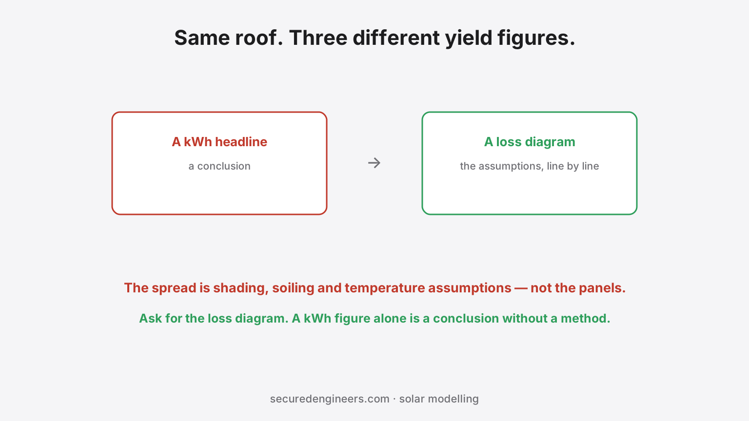
Ask three vendors to quote a rooftop plant and you will get three annual generation figures for the same roof, the same location and roughly the same capacity — sometimes differing by a fifth. Since the sun is not negotiable, the difference is entirely in what was assumed.
The headline kWh figure is an output of a model, and the model's inputs are where the disagreement lives.
What drives the spread
- Shading, and how it was assessed. The largest single variable. A model built from a site survey with actual obstructions — parapets, water tanks, AHUs, adjacent buildings, chimneys — produces a very different figure from one assuming a clear rectangle.
- How shading loss is calculated. Partial shading on a string does not reduce output proportionally to the shaded area; it can disproportionately affect the string depending on module and inverter topology. A model treating shade as a simple percentage understates it.
- Soiling assumption. Dust deposition in North Indian industrial areas is materially higher than a default. An optimistic soiling figure quietly adds several percent.
- Temperature losses. Module output falls as cell temperature rises, and Indian summer roof temperatures are punishing. Mounting height and ventilation behind the module change this.
- DC:AC ratio and clipping. Oversizing the array relative to the inverter raises annual yield but clips peaks. Whether clipping was modelled honestly moves the number.
- Degradation and availability. Year-one versus lifetime average, and what downtime was assumed.
Reading an estimate properly
| Ask for | What it reveals |
|---|---|
| The loss diagram, not just the yield | Every assumption, line by line — this is the document that matters |
| Performance ratio (PR) | A PR that looks too good usually means losses were understated |
| The irradiation source used | Different datasets give different baselines for the same site |
| Whether a physical shading survey was done | Distinguishes a modelled roof from a visited one |
| Soiling percentage assumed | Compare against the actual dust environment |
A vendor who supplies the loss diagram is showing their working. One who supplies only a kWh figure and a payback has given you a conclusion without a method.
Why the optimistic estimate is the expensive one
Because it sets the payback the investment was approved on. When the plant generates below the figure the business case used, the shortfall is discovered in year one and argued about thereafter — and as covered in what solar generation guarantees actually cover, the remedy depends entirely on how the guarantee was written.
Structural capacity is the other gate worth settling before yield is discussed at all — see rooftop structural loading on older roofs.
What we do differently
Our Solar EPC proposals include the loss diagram and the shading assessment behind the number, so you are comparing methods rather than optimism. The shadow-free area calculator gives an independent first check before anyone quotes.
More insights
Rooftop solar without roof leaks — penetrations, ballast and the monsoon test
The plant works and the roof does not. Leak complaints arrive with the first monsoon, months after the installer demobilised. Here is how the detail is done properly.
Solar EnergyYour Solar Plant Sleeps Through Your Evening Peak. A Battery Doesn't Have To.
Battery energy storage paired with rooftop solar lets a factory shave demand peaks, cut demand charges and shrink DG hours — and 2026 is the year the economics started genuinely working. But buyers keep sizing by kWh alone, skipping cycle-life warranty terms, and parking containers where fire codes say they can't sit.